合同会社シゴトトセイカツ
日頃からお世話になっている、クリエイティブディレクションを得意とする、シゴトトセイカツ社のホームページデザインを担当させていただきました。
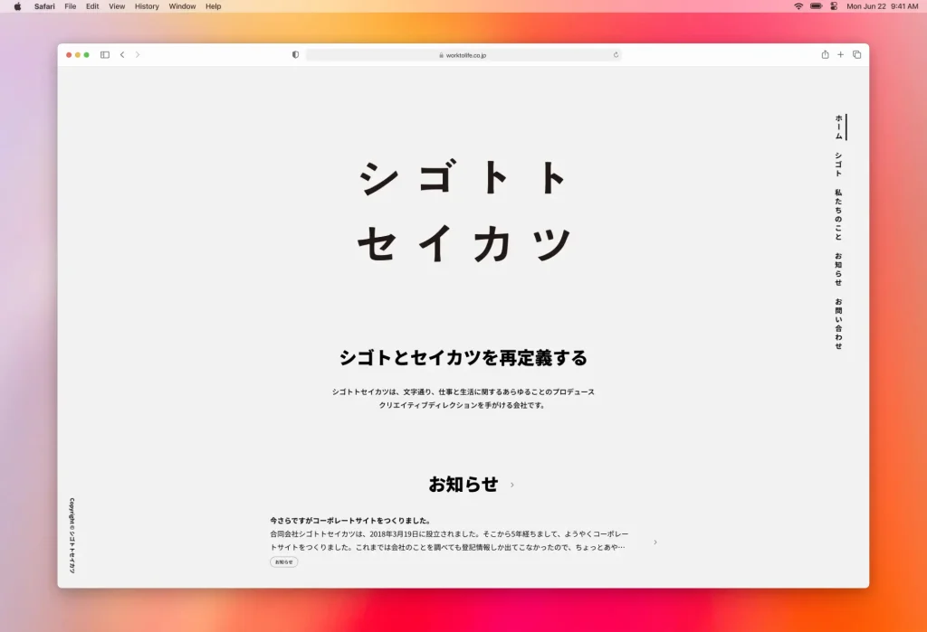
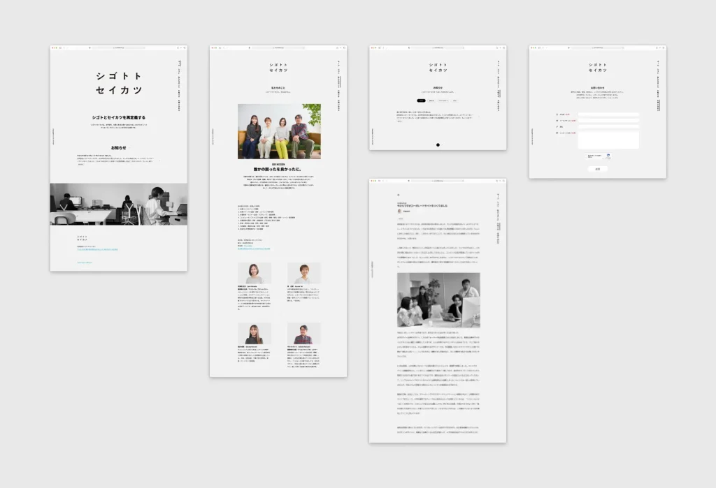
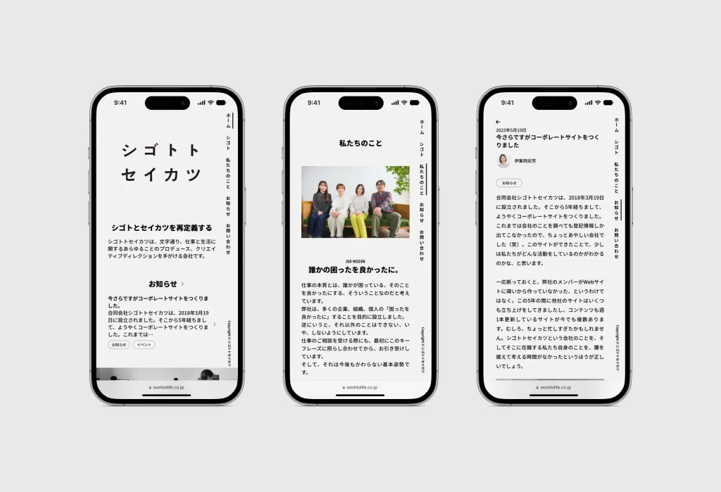
ご要望でもあった、シンプルで見やすいサイトを最大限目指しデザインを行い、レスポンシブ対応のワードプレスオリジナルテーマを作成いたしました。
シゴトトセイカツ社らしさをどうやって表現するか悩み、不必要な「色彩」や「動き」を排除し、空間を意識したシンプルさを大切にしました。また、文字の読みやすさにこだわりフォントはNoto Sans JPを使っています。
メニューは縦書きにし、シンプルながら個性のあるサイトになりました。このメニューは常に画面内に留まり、閲覧者は迷うことなくサイト全体を閲覧できる作りになっています。
ご要望でもあった、シンプルで見やすいサイトを最大限目指しデザインを行い、レスポンシブ対応のワードプレスオリジナルテーマを作成いたしました。
シゴトトセイカツ社らしさをどうやって表現するか悩み、不必要な「色彩」や「動き」を排除し、空間を意識したシンプルさを大切にしました。また、文字の読みやすさにこだわりフォントはNoto Sans JPを使っています。
メニューは縦書きにし、シンプルながら個性のあるサイトになりました。このメニューは常に画面内に留まり、閲覧者は迷うことなくサイト全体を閲覧できる作りになっています。