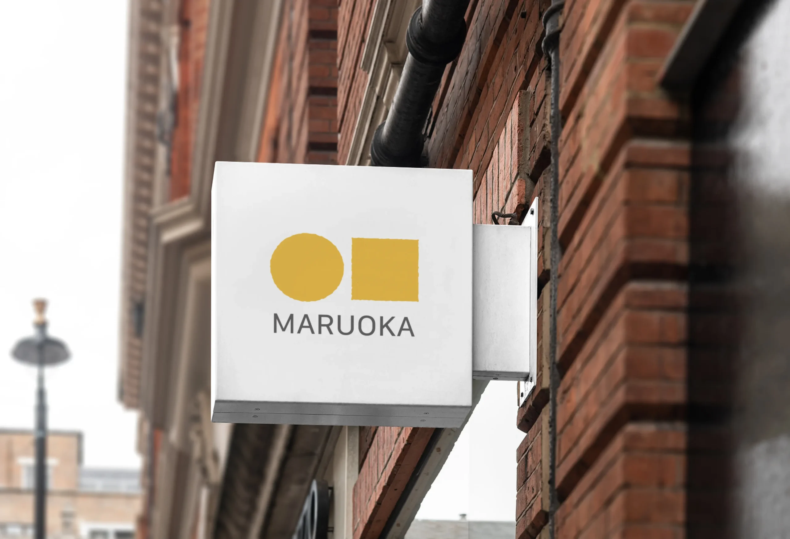
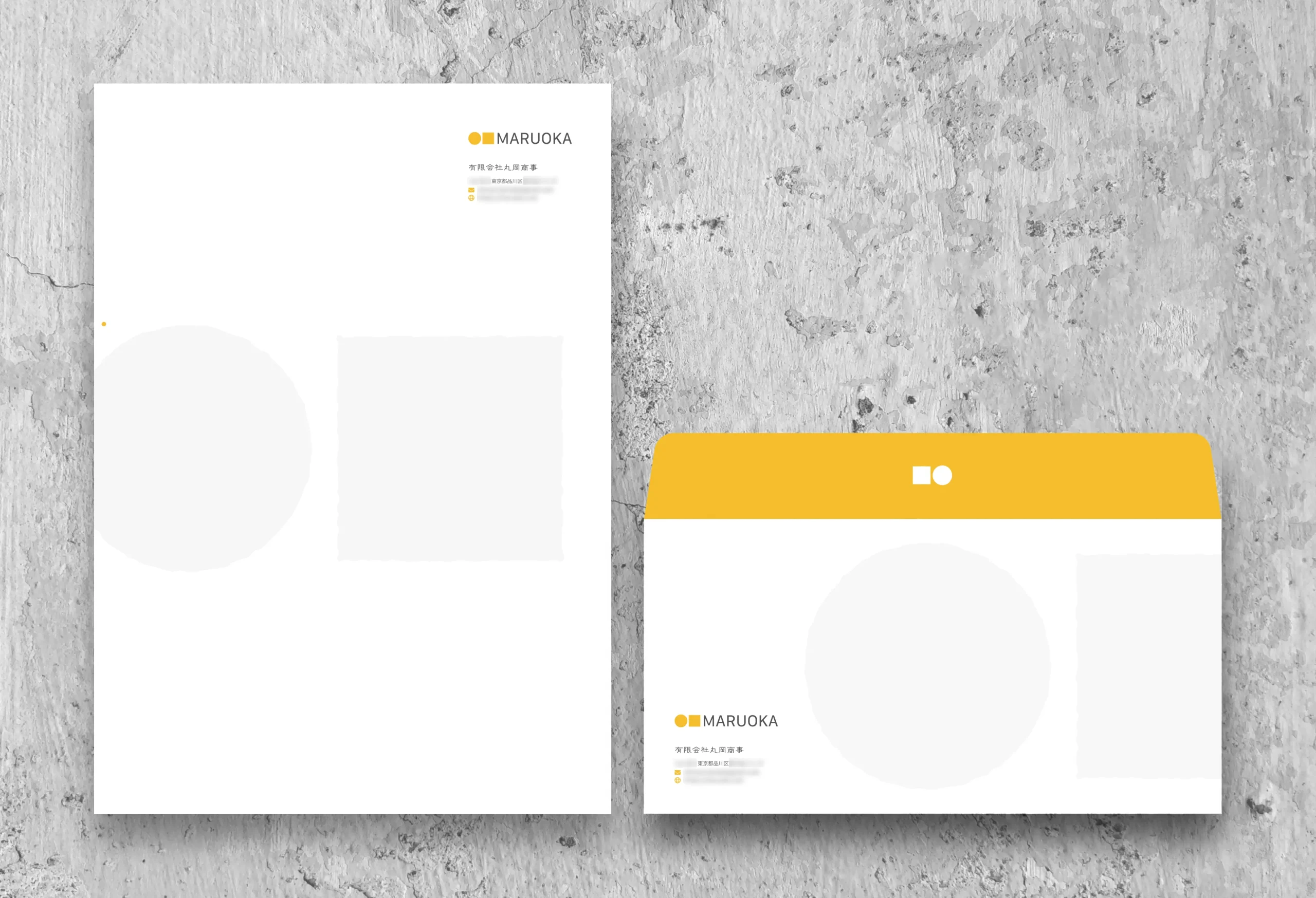
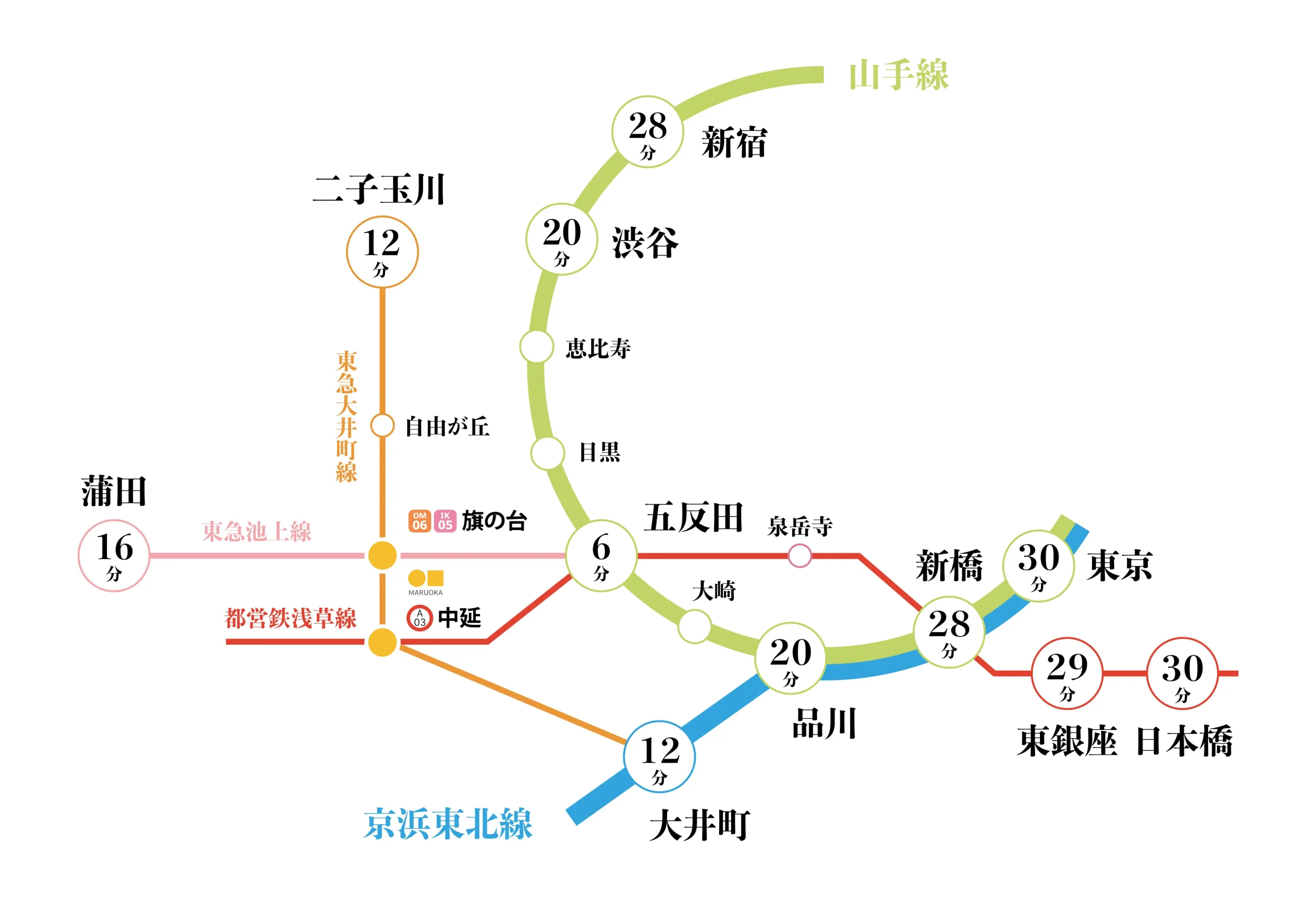
有限会社丸岡商事
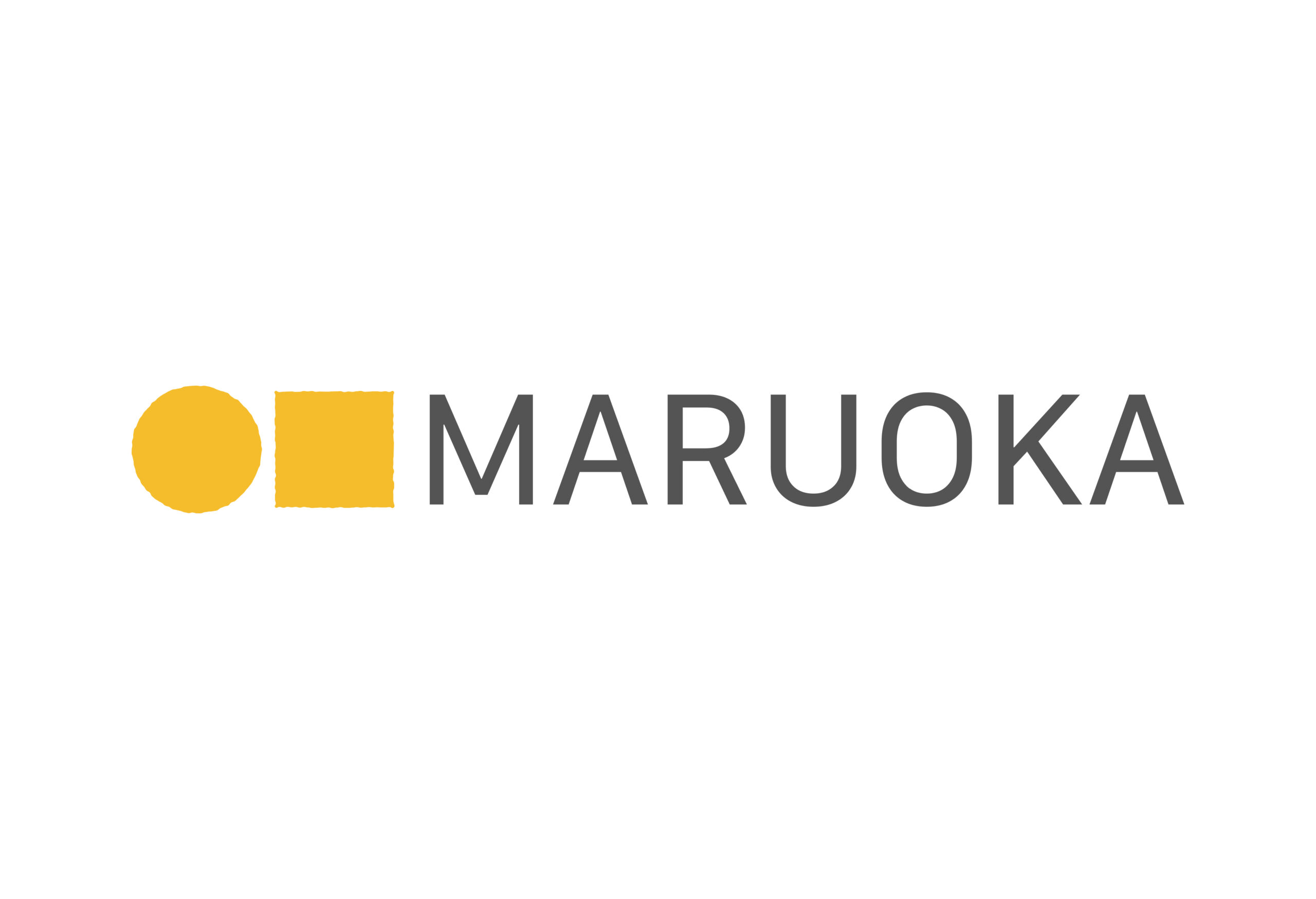
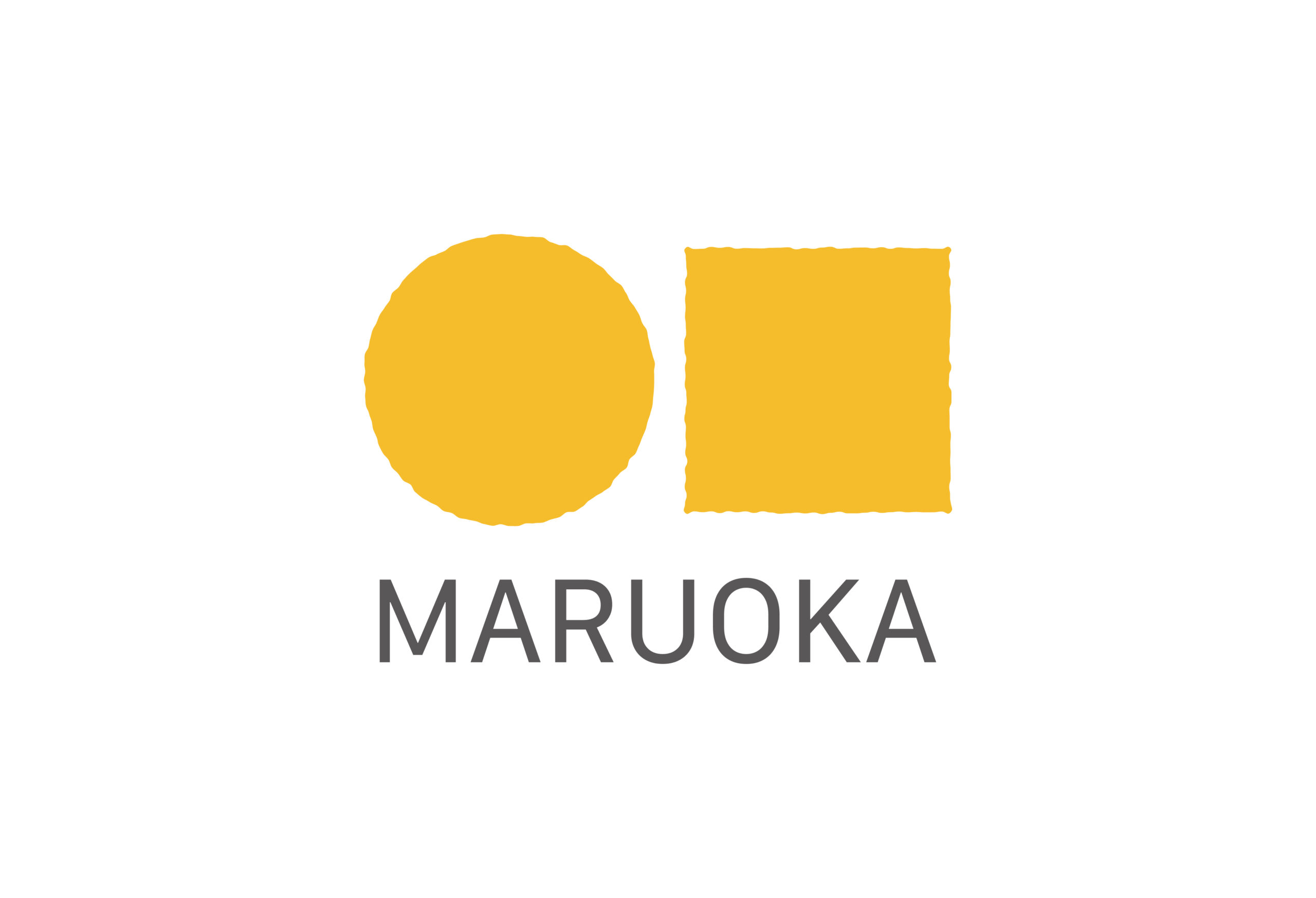
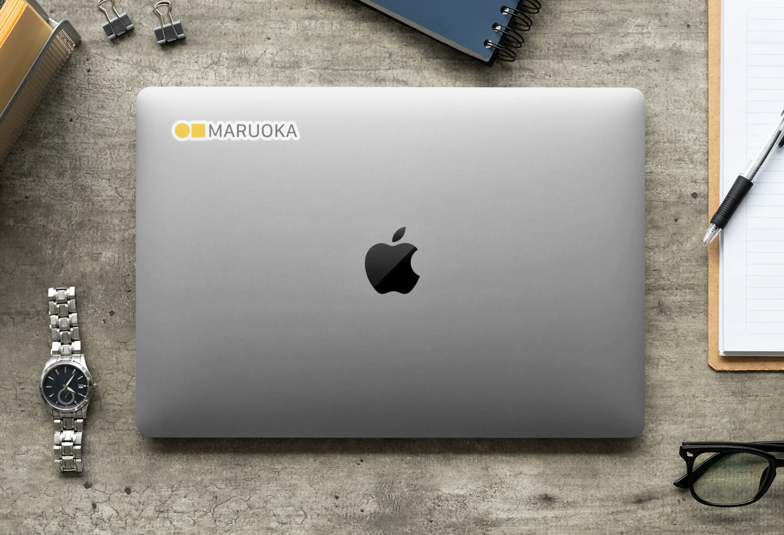
丸岡商事のロゴデザインは、社名の「丸」を円形で、漢字のフォルムから「岡」を正方形で表現しています。
シンプルかつ単純な図形を組み合わせ、独自性を追求することで、「丸岡」のアイデンティティを明確に表現しています。
このデザインコンセプトは、抽象的ながらも直感的に理解しやすく、ビジュアルに訴える力を持っています。円と正方形の組み合わせは、バランスと調和を強調し、同時にビジネスの堅実性と柔軟性を示唆しています。
線や細部の簡略化により、視覚的にクリーンで洗練された印象を与え、ブランドの信頼性と先進性を強調しています。
シンプルかつ単純な図形を組み合わせ、独自性を追求することで、「丸岡」のアイデンティティを明確に表現しています。
このデザインコンセプトは、抽象的ながらも直感的に理解しやすく、ビジュアルに訴える力を持っています。円と正方形の組み合わせは、バランスと調和を強調し、同時にビジネスの堅実性と柔軟性を示唆しています。
線や細部の簡略化により、視覚的にクリーンで洗練された印象を与え、ブランドの信頼性と先進性を強調しています。
MARUOKA
Maruoka logo design uses a circle to represent the ''maru'' in the company name, and a square to represent ''oka'' (from the form of the kanji).
By combining simple shapes and pursuing uniqueness, Maruoka's identity is clearly expressed. Although abstract, this design concept is intuitively easy to understand and has visual appeal. The combination of circles and squares emphasizes balance and harmony, and at the same time suggests solidity and flexibility in business. The simplification of lines and details creates a visually clean and sophisticated impression, emphasizing the brand's authenticity and progressiveness.
By combining simple shapes and pursuing uniqueness, Maruoka's identity is clearly expressed. Although abstract, this design concept is intuitively easy to understand and has visual appeal. The combination of circles and squares emphasizes balance and harmony, and at the same time suggests solidity and flexibility in business. The simplification of lines and details creates a visually clean and sophisticated impression, emphasizing the brand's authenticity and progressiveness.