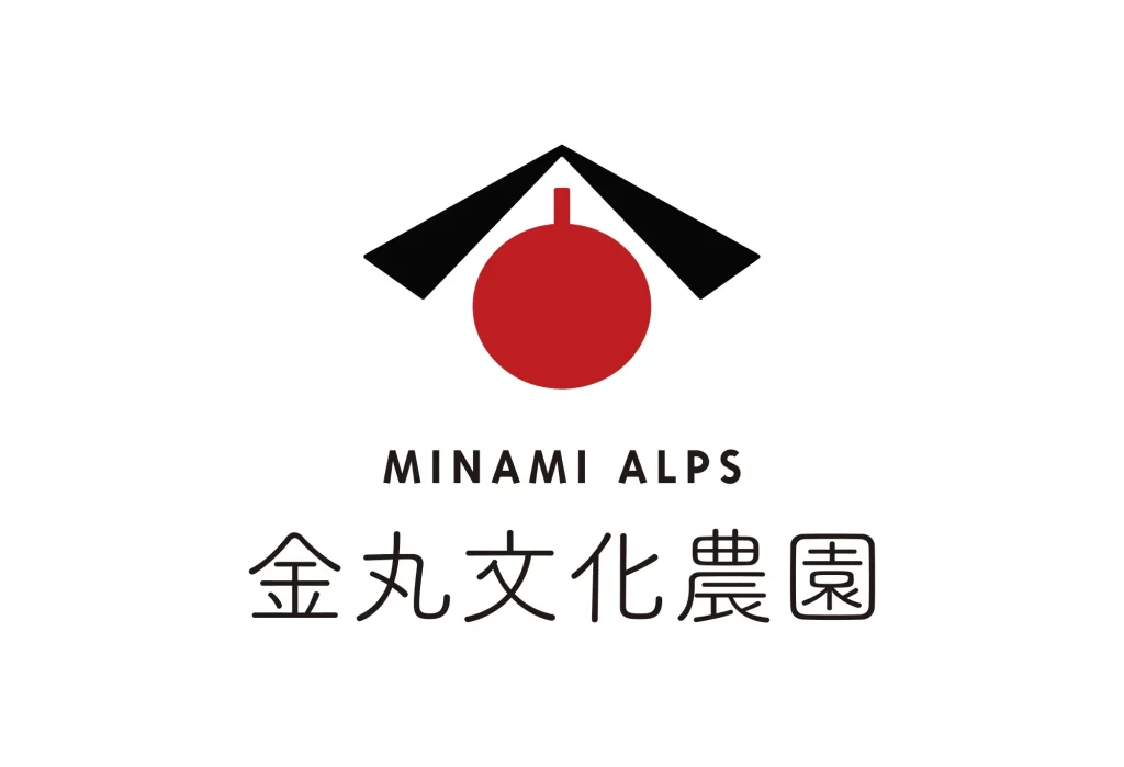
株式会社フォーユー
  • HOME
  • NEWS
  • CONTACT
  • PROFILE
  • SHOP
  • Facebook
  • Instagram
アプリのUI/UXデザイン、Webデザイン、ロゴデザイン、ノベルティグッズ制作、印刷物のデザイン全般にかかわるサービスを提供しています。目標の達成をサポートし総合的なデザイン制作やディレクションを得意としています。
お問い合わせ・ご相談
  • HOME
  • NEWS
  • CONTACT
  • PROFILE
  • SHOP
  • Facebook
  • Instagram

TAGS

  • CI.VI.LOGO
  • Application
  • Web

Kanemaru Bunka Farm

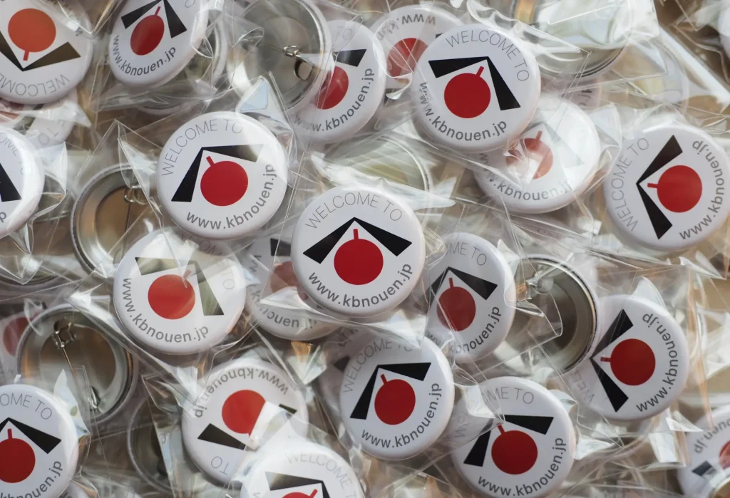
金丸文化農園のロゴをデザインさせていただきました!「金」の上の部分(介や今などの上部分と同じで「ひとやね」という部首、しかし「金」の部首は「かねへん」)と、「丸(=●)」を組み合わせてデザインしています。また上の部分は屋根でもあり一つ屋根の下、家族や家族同然の仲間(人)が集う場所を意味しています。下の丸い部分は、さくらんぼや桃であり、果樹園の地図記号をデザイン化したものです。伝統ある古くささとシンプルで斬新な新しさをミックスしたレトロモダンなロゴです。

I designed the logo for Kanemaru Bunka Farm! It is designed from a combination of the top part of “金” (the same radical in “介” and “今” etc. called “hitoyane”, but the radical in “金” is called “kanehen”) and “丸” (maru = circle). Also, the top part, which looks like a roof, symbolizes the place where family, and friends who are like family, come to gather under one roof. The round part below, either a cherry or a peach, is a stylized version of the symbol which denotes an orchard on a map. It’s a retro-modern logo that mixes old-fashioned tradition with a novelty that is both simple and original.

Hide Content
  • kanemaru2
  • kanemaru6
  • kanemaru3
  • macbook-mockup-template-on-a-wooden-table-a19495
  • OLYMPUS DIGITAL CAMERA
  • kanemaru4
Expand/Collapse Footer
  • POLICY

本サイト内における画像・文章をはじめとしたコンテンツの権利は株式会社フォーユーに帰属します。無断転載・複製を禁止します。

Copyright© 2003-2022
foryou, Inc.