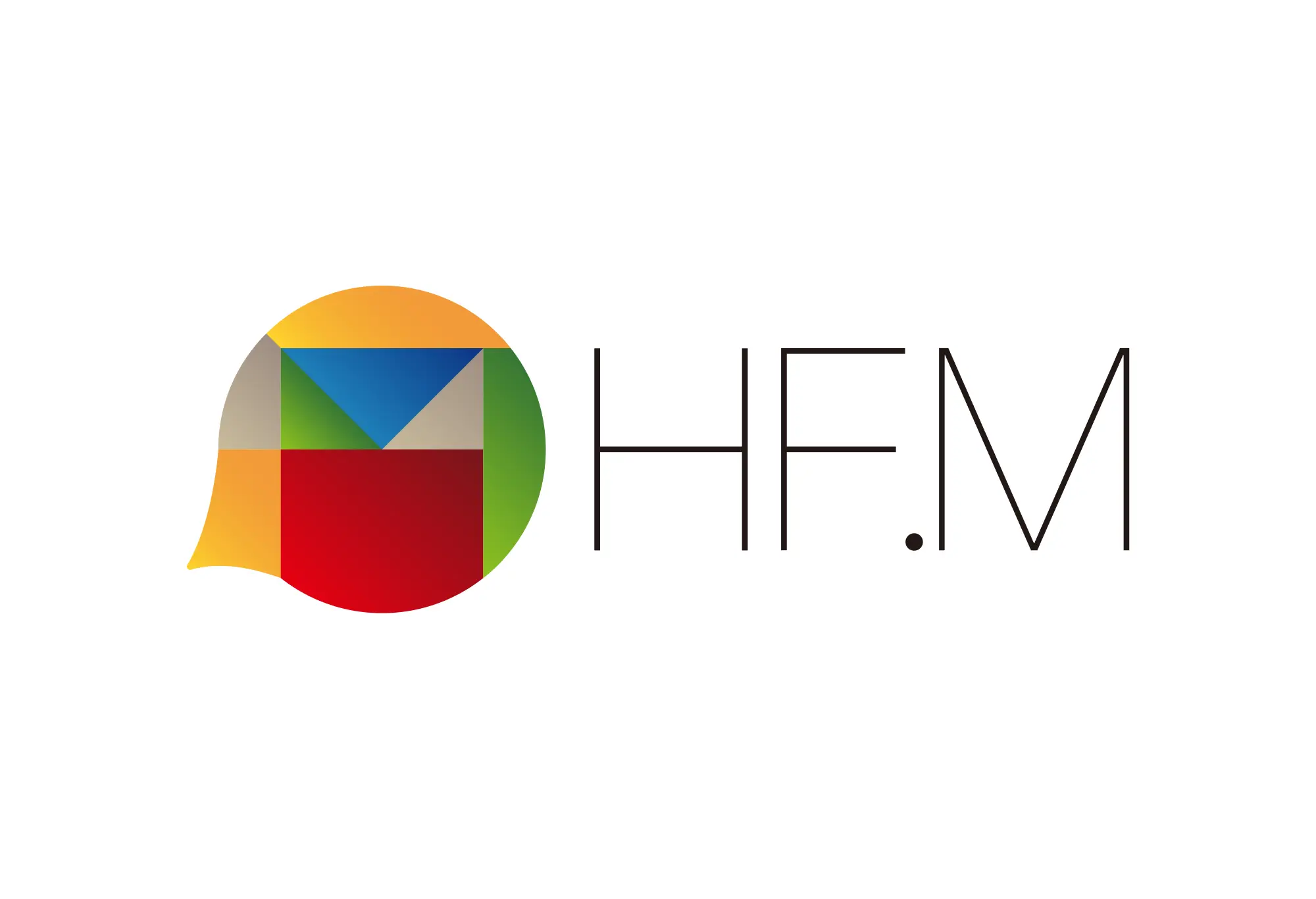
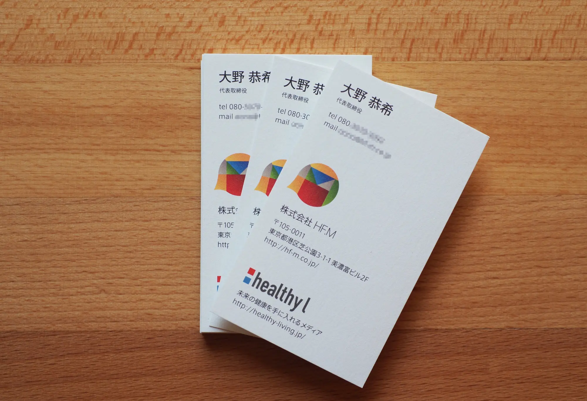
株式会社HF.M
会社名は「have fun media」の頭文字をとった「HF.M」。直訳すると「楽しんでねメディア」となります。
このロゴは「フキダシ」と「HFM」からデザインされています。
フキダシは、メディアとして人としての情報発信、アウトプット。感情や表現を意味しています。
そのフキダシにHFMをデザインとして取り込みました。
交差したラインやカラフルな色は、情報や感情、表現の多様性とそれらの融合や接点、楽しさを表しており発せられる情報のバラエティ性を感じさせます。色々な色を持つことで、多動力をも感じさせます。
これらは総合的に「楽しんでねメディア」をダイレクトに感じられるロゴになったと思います。
また「healthy l」は、同社のブログメディアのロゴになります。
このロゴは「フキダシ」と「HFM」からデザインされています。
フキダシは、メディアとして人としての情報発信、アウトプット。感情や表現を意味しています。
そのフキダシにHFMをデザインとして取り込みました。
交差したラインやカラフルな色は、情報や感情、表現の多様性とそれらの融合や接点、楽しさを表しており発せられる情報のバラエティ性を感じさせます。色々な色を持つことで、多動力をも感じさせます。
これらは総合的に「楽しんでねメディア」をダイレクトに感じられるロゴになったと思います。
また「healthy l」は、同社のブログメディアのロゴになります。
HF.M,inc.
HF.M (which stands for “Have Fun Media”) is the name of the company. Interpreted literally, it is the company’s way of saying, “Feel free to enjoy yourselves, media.”
This logo’s design is based on the letters “HFM,” and a speech bubble.
The speech bubble is our output and the information we disseminate, as media and as people. It signifies emotion and expression.
Inside the speech bubble, the letters “HFM” are incorporated as a design.
The intersecting lines and colorful palette represent the diversity of information, emotion, and expression, as well as the points at which they intersect and combine, and the fun they provide. They also give a sense of the varied nature of the information that is being transmitted. The design contains many colors, and this also gives a sense of dynamism.
I think that all of these aspects add up to a logo that directly conveys the message, “Have fun, media.”